I first noticed Segoe UI when I got my notebook updated to Windows 8. I noticed a change in Arabic characters from Tahoma.
Everytime I use Segoe UI, I find it very satisfying. Especially in Arabic. I used it in the web app Writer as a main font (since version 3.5), in my main blog, and then used it in discussion websites like Arabia I/O, using some browser extensions.
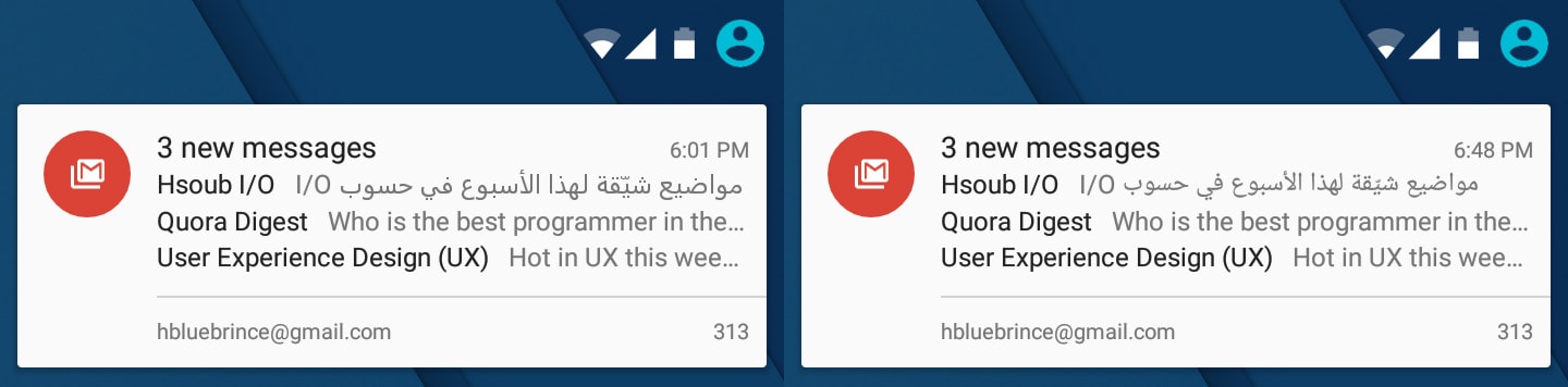
After my extensive use of the font, I started to notice the difference between Segoe UI and Droid Naskh (or Noto Naskh now), the main Arabic font in my Android phone, in terms of both legibility and appearance.
Also, Droid Naskh only had a regualr weight, which makes mixed Arabic and English text (a very common scenario) look very “embarrassing”, especially in light or thin weights.
With Android
So, I decided to make a little experiment: changing the Arabic font on my Android phone to Segoe UI. And since I already had root permissions on my phone, it didn’t seem like a bad idea.
At the beggining of this experiment, my phone was running a KitKat ROM, then I moved to a Lollipop one at the end.
First step: testing
First thing, I looked for a “fonts” folder in the system directory (root/system/fonts), looked up “DriodNaskh” in it, then replaced the font with Segoe UI after I renamed it “DroidNaskh”. And it worked immediately. I opened Pocket, and I liked what I saw.

Second step: a better way
At this point, the fonts directory had a Droid Naskh font with Segoe UI characters. The next step was doing it better.
As built-in fonts in an OS, I assumed there to be a config file containing default fonts the system calls when needed. So, I opened the AOSP project page on GitHub and searched for “DroidNaskh”, to find two interesitng files: system_fonts.xml and fallback_fonts.xml.
I opened system_fonts.xml. The file only had Roboto and Droid Sans, so it was safe to assume that Droid Naskh serves as a fallback font.
I opened fallback_fonts.xml and replaced every Droid Naskh entry with Segoe UI. Then I copied Segoe UI fonts to the fonts directory with their original names, and restored original Droid Naskh fonts that I previously replaced.
At this point, the fonts directory has the default Droid Naskh (as it was), and Segoe UI fonts that I added. All of them having their right characters.
fallback_fonts.xml: Before
|
fallback_fonts.xml: After
|
This time, though, it didn’t immediately work. So, I rebooted the device, only to find that all Arabic characters are displayed as replacement ones. I was lucky to be using a file explorer that displays file permissions for each file in the root directory, so I noticed that the fonts I added, by default, didn’t have permissions for non-system apps to read them (-rw-------). So I updated the permissions (to -rw-r--r--) then rebooted the phone, and it worked.
So, why a reboot was required this time? The only reason I could think of is that the system only calls the config file once at startup, cache it, and then uses the cached version to call any needed font. Which makes sense.
This “better” method doesn’t require removing built-in files, doesn’t “trick” the system by renaming files, makes it easy to get back to original fonts, and will allow adding more weights to any font. Unlike the previous method.
Third step: adding weights
Segoe UI has weights starting from light (300), unlike Roboto (the default Latin font), which has weights starting from thin (100). Still, it’s much (…very much) better than not supporting both, as is the case with Droid Naskh.
It didn’t seem complicated here: I copied the node containing the normal weight font file (called “regular” here), and replaced it with the light version, then repeated to add a bold version too (KitKat didn’t even have a bold weight of Droid Naskh). It worked after another reboot, and I liked it even more!
<fileset>
    <file>SegoeUI-Light.ttf</file>
    <file>SegoeUI-Regular.ttf</file>
    <file>SegoeUI-Bold.ttf</file>
</fileset>fallback_fonts.xml after adding weights.
Fourth step: moving to Lollipop
Regarding fonts, there are several differences moving from KitKat to Lollipop:
- The files
system_fonts.xmlandfallback_fonts.xmlwere merged into one file calledfonts.xml, with a different markup structure. - Droid Naskh was renamed to Noto Naskh.
- Noto Naskh now has a bold weight.
Which means that changes we made earlier to fallback_fonts.xml and Droid Naskh will be made in Lollipop to fonts.xml and Noto Naskh, with some syntax changes.
Regarding syntax change, the new syntax in fonts.xml is more flexibe. It allows specifying font weights and styles (normal/italic) for each font file explicitly, without relying on other factors (like file order). Also, the new syntax makes more sense; so, instead of file there’s font, and instead of putting fonts inside a fileset, they will be added directly to family.
|
|
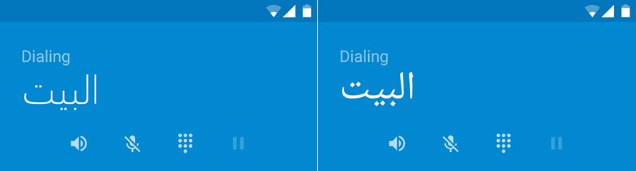
As its name tells, Segoe UI is mainly designed for user interfaces, but I found it very comfortable in reading long articles too.
Segoe UI and Tahoma have something in common: they both look good in small sizes, but it gets worse as they get bigger in size. But this applies to normal weights. The multiple weights in Segoe UI makes it look great even in bigger sizes, especially in lighter weights, which is a big feature to differentiate both fonts.
This font is not free, let alone open source, as is the case with Noto Naskh. And until now, I couldn’t find a way to buy it separately, but it comes embeded with the latest Windows and Office versions (starting form Windows Vista and Office 2007). And even in the font’s page on Microsoft’s website, the link refers to Microsoft’s page on Fonts.com, which doesn’t have the font… for some reason.
If you wanted to see a website using Arabic characters of Segoe UI in several weights, visit any Arabic verison of Microsoft.com. This website also has web versions of the font (in woff and eot formats), which means there’s a way to use it natively on the web too.
Alternative title: Segoe UI is Sugoi.